Wednesday, October 27, 2010

Creating QR Codes

QR Code Website http://qrcode.kaywa.com/

QR Code Set Up
URL TEMPLATE layar://georssgateway?SEARCHBOX=$SEARCHBOX_2=$SEARCHBOX_3=

QR Code 1
Coords -33.918228, 151.227800
URL layar://georssgateway?SEARCHBOX=http://tinyurl.com/27wodtq&SEARCHBOX_2=-33.918228&SEARCHBOX_3=151.227800


QR Code 2

Coords -33.918497, 151.227757
URL layar://georssgateway?SEARCHBOX=http://tinyurl.com/27wodtq&SEARCHBOX_2=-33.918497&SEARCHBOX_3=151.227757

Model

Coords -33.918386, 151.227925

Model Tiny URL http://tinyurl.com/27wodtq

Interactive Poster

Interactive PDF Download From Megaupload
Refereces Link For Poster Download From Megaupload

I have had difficulty putting a download link on my blog as FileFront will not accept my file as it is too large so I have uploaded it to MegaUpload. You will need to retype the code it provides, wait while the seconds count down and then select Regular Download. If that does not work then you will need to view my poster on Emustore at the link below.

Interactive PDF on emustore:
Download References Link For Poster Here


Here are some of the videos that are embedded in my poster.

Video of rendered images - *-

3D Google Warehouse -


Sketches of Frank Gehry Trailer -


Frank Gehry Talks on TED -

Monday, October 25, 2010

Printable Poster - Scientia Pavilion


In the design of my poster I have gone through the same process of deconstruction. The first poster is of the Scientia Pavilion shown in one large square or cube so as to reflect the cubist style from which Frank Gehry's work originated. The second poster outlines the background to my interpretation of the Vitra Design Museum, highlighting the architect and his design style and as such the foundation for the Pavilion. This second poster is broken up into a clear and orderly 3x5 grid. The third poster concentrates on the concept and design of the Scientia Pavilion from the Vitra Design Museum. In the same way that Gehry's work, and in turn my design, broke down geometry and reorganised it based upon sketching, so the rules of the 3x5 grid are broken and images and text overflow from their 'containers' creating a more chaotic appearance than the previous two.

Text For Poster

Knowledge

Frank Gehry

Re-interpreting the Vitra Design Museum one needs to understand the architect behind it. Born Frank Owen Goldberg on 28 February 1929, he changed his name to Gehry to be accepted by an anti-Semitic industry of the time. He studied architecture at the University of Southern California and later city planning at the Harvard Graduate School of Design. Much of his success appears to be almost accidental and owing to his rebellious nature. He designed cardboard furniture which was successfully sold in Bloomingdales, so in his cantankerous manner he designed more cardboard furniture “which nobody would like”. In response to the revival of Greek temples, Gehry stepped back a further 300 million years to the ‘revival’ of the fish from which he gleans much inspiration for his designs.

Deconstructivsm

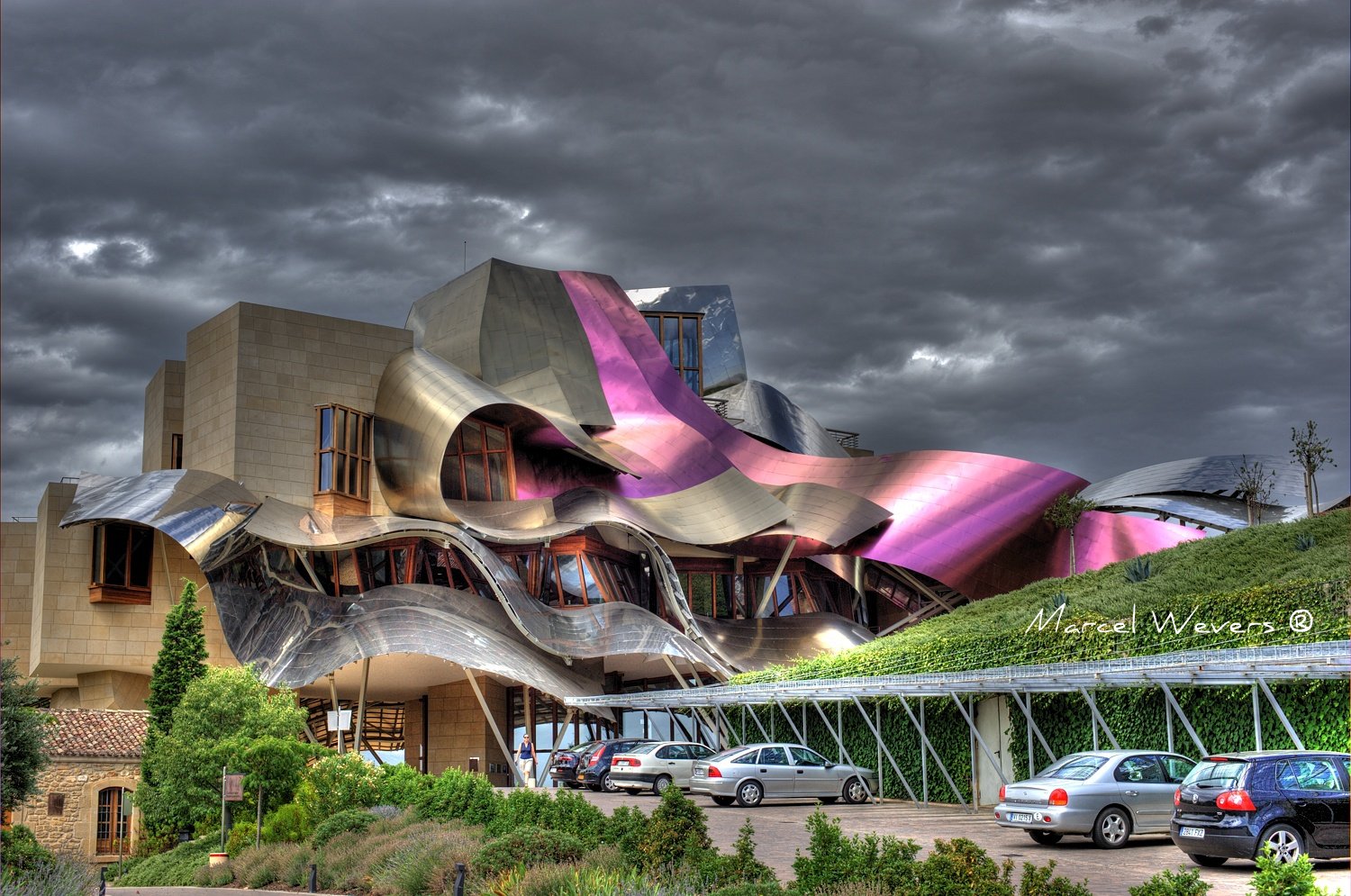
In reaction to modernism and post modernism Gehry broke the rules, particularly that where ‘form follows function’. In his Vitra Design Museum (1988) he took typically cuboid forms and distorted them to create unpredictable yet controlled chaos which paid no attention for its intended function and is clearly apparent in his later work the Marques de Riscal Hotel, Elciego, Spain (2006). His designs begin with a series of sketches, impulsive fluid lines with no sense of mass or weight only portraying a sense of direction and spatial context. The sketches are quickly made into 3d models and through “organization of the artist” his buildings remain true to the original designs and budget. He is particularly concerned his buildings are always seen with their surrounding context.


Visualisation

Concept and design

The concept for my interpretation of the Vitra Design Museum comes from the Vitra’s elemental geometry, the sloping roofs and the spiral stairs. Using these playful swirls and planes, I envisaged a public space for the university where people could come together to study, exchange ideas as well as stage functions and performances. Researching folded architecture helped me to comprehend how this may work. I studied another work by Frank Gehry which gave me further insight into his style and design process. Based upon this I sketched my idea of what the pavilion might look like and made a representational montage. The core model was made using Gehry’s style of deconstructivism by disassembling the Museum down to the core form. A second level was added by copying, rotating and elevating the original. With the basic model in place I then reconstructed it to produce cleaner geometry, smoother curves and molded it as one structural sculpture. It was a detailed process to create the new architecture whilst remaining true to the original building and creating something unique whilst preserving the essence of Gehry’s style.

“... a continuous changing swirl of white forms on the exterior, each seemingly without apparent relationship to the other, with its interiors a dynamically powerful interplay, in turn directly expressive of the exterior convolutions. As a totality it resolves itself into an entwined coherent display...” - Paul Heyer

Frank Gehry References

Frank Gehry -http://en.wikipedia.org/wiki/Frank_Gehry

Interview - http://www.ted.com/talks/frank_gehry_as_a_young_rebel.html

Portrait – http://www.ninjavspenguin.com/blog/wp-content/uploads/2008/01/frank-gehry.jpgCardboard

Furniture - http://www.gimmii.nl/wp-content/uploads/2010/05/Veiling-Wright-Bubbles-stoel-Frank-Gehry.png

Fish Lamp - http://www.paperny.com/gehry2/gehry_fish_lamp.jpg

Deconstructivism References

Deconstructivism - http://en.wikipedia.org/wiki/Deconstructivism

Gehry -http://en.wikipedia.org/wiki/Organization_of_the_artist

Gehyr - http://www.arcspace.com/studio/gehry/

Marques de Riscal Hotel - http://farm3.static.flickr.com/2584/3748406301_d2ce243f3b_o.jpg

Marques de Riscal Model - http://picses.eu/image/fa6b9716/

Marques De Riscal Sketch - http://www.arcspace.com/architects/gehry/riscal_winery2/17riscal.jpg

Gehry Sketches - http://apfcetsam.files.wordpress.com/2008/12/sketches_of_frank_gehry_xlg201.jpg


Visualisation References

Vitra Design Museum - http://www.flickr.com/photos/wojtekgurak/4107951711/in/photostream/

Vitra Museum - http://en.wikipedia.org/wiki/Vitra_Design_Museum

Paul Heyer. American Architecture: Ideas and Ideologies in the Late Twentieth Century. p. 233-234

Gehry's Buildings - http://entertainment.timesonline.co.uk/tol/arts_and_entertainment/visual_arts/article1850794.ece

Video ReferenceGehry Sketches - http://movies.nytimes.com/movie/338051/Sketches-of-Frank-Gehry/trailers

Picture for Sketches - http://apfcetsam.files.wordpress.com/2008/12/sketches_of_frank_gehry_xlg201.jpg

Sunday, October 24, 2010

Layar Screenshots


The model is now well proportioned in Layar. Some aspects aren't working so well. The lighting isn't great so the white texture becomes over exposed and then undefined as seen on the staircases. Some of the model disappears as you rotate it. I did check all the normals however I think this maybe due to the complexity of the curves and so forth and it is possible that some of the lines do not meet properly causing the problem ie the software is only seeing a face. Some of the shots worked well though. I went in to test it on the iPhone but it was not finding any point of interest possibly due to a fault in the client side ie us. The QR was being tempermental but did eventually pick up my signs. As a result, I may not get any iPhone screenshots until testing day.


Saturday, October 23, 2010

Layar Attempt

The first attempt at putting it in Layar did not work well at all. Josh had to fix some things his end and my model came out with some strange textures which I don't believe I had applied. The sizing was also completely wrong.

I have remodelled the pavillion to reduce polygons (7,000+), completely redone the textures and optimized the model to be under the 5,000 polygons required. I have spent some time scaling it and moving it for layar and the results are as follows:

The model has now come out better, however the scaling is still completely wrong. In 3ds Max the model is approximately l-16.5 x w-14 x h-9.3 m. But the layar picture above is at 419m distance. When I move in closer my eye level is what seems to be around 4.5 m. I think I will need to test it on an iPhone to see how it appear through that.

I zoomed in on this just to show the three textures. The white plaster texture has come out well but has no texture from a distance. The sandstone is looking a bit bland. The glass texture was a standard one from Sketchup but Layar does not support transparency. Whilst I wish to use these sort of textures/colouring for my pavillion, it is interesting to see that it is not as striking in texture as my glasshouse in assignment 1. The detailed texture in that worked well whereas a plain texture here just becomes rather cartoonish.

I feel somewhat disappointed with the Layar result as the renders have come out well using Vray in Sketchup. Ironically, something with more detail may work better and perhaps not being quite so large. Another potential issue I have learnt with this is that my pavillion is completely elevated off the ground so that arguably is not going to be much fun to 'walk around' and can probably only be viewed with any interest from a distance. I am considering taking the lower level of stairways off and placing it directly on the ground just for the Layar exercise.

Conclusion :
Structures are possibly best at around the 2-3m mark. Structures which are on the ground level will be more engaging even if they reach up into the sky. Detailing is relatively important to engage the viewer. I am thinking a maze type structure might be the most entertaining use in Layar where one might be able to walk through a series of rooms with detailing in each of those rooms.

Tuesday, October 19, 2010

Draft Model and Texture


This is a draft model using one of the chosen textures. The texture is going to have to be rethought as it needs to be quite pure in colour and texture so that the 'folding' of the re-designed museum can be accentuated. If the texture is too busy then it will detract from the angles and curves which were created as the roof lines.

The Pavillion In Context

This is what the pavillion would look like on the village green.

Friday, October 15, 2010

Expressive Sketches for Re-Invented Vitra Design Museum


I used Frank Gehry's style of sketching to create these expressive sketches for my design concept. They depict the lines and curves I wish to use in my model. They are reflective of Gehry's Hotel which I did for my architectural study in the geometric shapes being contrasted with the flowing lines of the spiral staircases. From these sketches I am thinking that the model will become an outdoor public space for the university. Perhaps used by students as an area to congregate, study or even perform - an outdoor pavillion.

Friday, October 8, 2010

Vitra Museum Rendered Images

I particularly chose these angles to render as the geometry and angles are significant for my re-interpretation of the Vitra Museum.

The original external image of the Vitra Museum.

External render of model
Image of the original building's internal spiral stairs

Internal render of the model's spiral stairs

A3 Expressive Montage -


References
Cardboard House - http://www.architecturaldigest.com/images/homes/2005/11/unbuilt_houses/hoar01_unbuilthouses.jpg [accessed 8 October 2010]
Cardboard Texture – https://blogger.googleusercontent.com/img/b/R29vZ2xl/AVvXsEjM9uQ30cbcUY4KvoIyQo1CPTCtnmVIKtv2hCj7D5f_ipFudMaB95VHcHQPMRm4wiDPuHlnTaR_vt9egI7rknoNhNfAvbC-G1Ekx-LjdKLCazt3VWq3Q7eiDGvj40p5FOLrSi0wBf18yYA/s400/2009_0328KLDWkNEarthHr0002.jpg [accessed 8 October 2010]
Folded Paper - http://www.vestaldesign.com/blog/wp-content/uploads/folded-paper-flickr.jpg [accessed 8 October 2010]
Folded Model - http://www.electricallypoisoned.com/files/gimgs/8_masterdiagramstrectched.jpg [accessed 8 October 2010]
Arches - http://static.dezeen.com/uploads/2008/08/isar_sciarc_3141s.jpg [accessed 8 October 2010]
Folded Architecture - http://www.designboom.com/cms/images/ride/aa01.jpg [accessed 8 October 2010]
Kroll Pavilion - http://inhabitat.com/wp-content/blogs.dir/1/files/2010/05/John-E-Kroll-4.jpg [accessed 8 October 2010]

Textures

The colours are inspired by Gehry's Marques de Riscal Hotel although I have concentrated towards gold tones which are found on the hoods of the graduation gowns of the University of New South Wales as the building is to be situated on the Village Green of the University and therefore a connection to the University is critical. Some of the textures also reflect the layering and folded effects which I hope to achieve with the new architecture.

Texture References:

Woven Gold - http://image.shutterstock.com/display_pic_with_logo/57169/57169,1233358205,26/stock-photo-tightly-woven-golden-pattern-seamless-texture-for-background-24142408.jpg [accessed 8 October 2010]
Corrugated Cardboard – http://www.crestock.com/images/1440000-1449999/1448431-xs.jpg [accessed 8 October 2010]
Folded Boxes - http://www.rhapso.com/UserFiles/Image/folded_boxes.jpg [accessed 8 October 2010]
Sandstone - http://www.tlccreationsetc.com/uploads/images/Faux%20Finishes/Sandstone%202.JPG [accessed 8 October 2010]
Driftwood - http://www.redzonefilms.com/pics2/driftwood.jpg [accessed 8 October 2010]
Colour Paper - http://www.designsbuzz.com/wp-content/uploads/2009/10/colorful_inks_paper_texture_by_enchantedgal_stock.jpg [accessed 8 October 2010]
Blue Swirls - http://lh4.ggpht.com/_gh_MUzMAX5A/SUhfIqW5YGI/AAAAAAAAAHQ/DEAImrvMB5Y/background_fractural_blue.jpg [accessed 8 October 2010]
Folded Paper - http://thumbs.dreamstime.com/thumb_381/12382593205DXYep.jpg [accessed 8 October 2010]
Gold - http://fc05.deviantart.net/fs16/f/2007/224/7/6/Texture_71___Gold_by_WanderingSoul_Stox.jpg [accessed 8 October 2010]
Gold Weave - http://popartmachine.com/machine/daily/112008/grid-pattern-and-texture-study/orange-ridge-grid-work-pop-art.jpg [accessed 8 October 2010]

Re-Invention Final Concept - FOLDED ARCHITECTURE/LANDSCAPE ARCHITECTURE

In discussion with my tutor with regard to my initial concept, he refocused me to the area which interested me most - the sloping roof tops. This led to the concept of folded architecture/landscape architecture. On his advice I am going to concentrate more on the design and reinvention of design rather than on the building's specific function. This will allow me greater freedom with my ideas and to come up with something more striking than focusing on the function of the building.

I will begin by removing as many walls as is feasible from the existing building and be left with the rooftops and some supports. I will then manipulate the remaining structure to provide a ‘level’ for the new architecture. Further levels will be copied from this structure and twisted and turned to intertwine the levels into a single structure with a hint of continuing floor level such as in a carpark.

My chosen architecture, the Marques de Riscal Hotel, has undertones of this idea in its roof top which swirls around on supporting columns. My design will be more linear and angular as Layar is unlikely to support such curved shapes. I intend to use some of the colouring from the Hotel in my design as I find it quite striking.

Thursday, October 7, 2010

Folded Architecture

X Architeckten - Vienna Woods, Austria

Fabian Tan - Folded Canvas, Kuala Lumpur


Library, Baton Rouge


Convention Centre, Dublin


Mader Stublic Wiermann - Folded Space, Sao Paolo


Kanner Architects - Planned For Malibu


Iwamoto Scott - Voussoir Cloud


Helen and Hard - Norway Powered By Nature


These images are referenced under my Expressive Montage and are part of the research undertaken to produce the montage.